I'm shaking things up this week. Tuesday's This and That will be moved to Thursday for just this week. This week I'm interested in what colors and kinds of fabrics you gravitate towards. There is no right or wrong answer. I'm just interested in what YOU love.
We have something these days that quilters of the past didn't have. We have tons of choices of fabrics. It's very rare that I find an antique article that explains what colors a quilter could choose. One exception was a home demonstration class from 1937 that had a topic of "Choosing Colors for your Quilt and how to Judge a Quilt." Another unusual topic was a story syndicated in 1929:
Still the emphasis of the story was just as much on the quilt pattern as it was on the rather limited palette selection.
Folks who study quilts can often date a quilt by the colors and fabric choices. This isn't an exact science but most of you could identify the time frame for these quilts:
Last quarter, 19th century
Early 20th century
1920s-1930s
How historians date our quilts will depend on us. Labeling a quilt is crucial to dating our present our future quilts. We have so many choices.
And whatever fabrics you like, there are no right or wrong answers.
Whenever I get interested in a topic, I first begin by checking out a ton of books to read. It's my first step in research. When I wanted to study quilts, I read a number of books but Ruth Finley's book stopped me dead in my tracks. The book was called Old Patchwork Quilts and the Women Who Made Them.
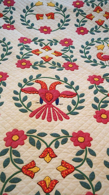
Ruth Finley wrote about "Pennsylvania Dutch" quilts or the textiles produced by Pennsylvania Germans:
"Only a soul in desperate need of nervous outlet could have conceived and executed . . . the “Full Blown Tulip” . . . , a quilt of Pennsylvania Dutch origin. It is a perfect accomplishment from a needlework standpoint yet hideous. The ‘tulip’ block is composed of eight arrow-shaped patches of brilliant purplish red, . . . the eight petal-shaped patches inserted between the red arrows are a sickly lemon yellow. The center of each tulip is . . . homespun of the most terrifying shade of brownish green, beyond question the accident of a private dyepot. The whole is surrounded by a . . . border . . . of dazzling bright orange. This green-red-lemon-orange combination is enough to set a blind man’s teeth on edge. And yet as an example of needlecraft the quilt is a triumph."
All I could think of at the time was my brother's voice saying, "well them's fighting words."
Finley softened her criticism when interviewed for newspaper articles she gave in 1929 and the early 1930s to promote her book. "Pennsylvania quilts are easiest of all to identify," she was quoted as saying. "They are gaudy, bold, and elaborate, more often pieced than appliqued, and have superlative quilting."
I would even suggest that there were plenty of appliqued Pennsylvania German quilts but Finley hadn't been exposed to them.
Quilt historian Laurel Horton used this quote in an essay that you can read here.
But here's the irony. Collectors these days love LOVE Pennsylvania German quilts and they are much sought in the quilt market.
Finley passed in 1955, about the time there was a renewed interest in "Pennsylvania Dutch" folk craft. Quilt kits were marketed like the one below to emulate the quilts made by Pennsylvania Germans:
And a variety of home decorative fabrics were made and printed well into the 1960s:
Finley was and is a respected quilt historian and was inducted into the Quilters Hall of Fame in 1979.
There may be "no crying in baseball" but there's also "no bad fabric choices." What you love is what you love. So tomorrow, I get to find out just what kind of fabrics (and hopefully why) you love them!
Have a safe and happy day!

.JPG)

.JPG)


My 1st edition of Finley's book sold for $25 in a study group auction on Saturday.
ReplyDeleteThank you for the link to Laurel Horton's article. Implicit bias -- not only fabric (LOL).
ReplyDeleteI am drawn to deep colors that have a little black in them. I loved Civil War Era fabrics from the first time I saw them. But I think I loved them as much for their history as for the actual color. I also love reproduction quilts with these colors. I like fabric lines that have large florals in them so I can use the floral as a focus to assemble the rest of the fabrics and many times use it as the border. I'm not as fond of spring time colors because they don't have as much contrast with the light backgrounds. I love high contrast. I have bought all kinds of fabrics like Kaffe Fassett, Tilda, Art Gallery, and Janet Clare's wonderful blues but I always go back to the reds, greens, golds, and blues of a richer deeper color.
ReplyDeleteI was all about 1930s pastels, depression/Nile green and feedsacks. I still like them but now using more contemporary, brighter, abstract prints and batiks. Always and forever, polka dots.
ReplyDelete